
terça-feira, 25 de junho de 2013
The textures used:
These are the 4 textures applied to the bridge. The last (in blue) was used in a single point (with no repetition) as an ornament to the central gathering space.


Dropbox link
Link for Cryengine level folder and Sketchup files of bridge and Folly.
https://www.dropbox.com/home
https://www.dropbox.com/home
Crisis Environment
Progression of the environment:
From the draft version, I strived to break tessellation with some success (part of vegetation and other natural objects show up white).
The environment at its draft stage with folly and elevator.

The final environment.
Extra images
Since I could not export my bridge into crisis even after braking it down into several components, I am adding extra images. The sketchup model and Cryengine level are both (separately) available on my Dropbox.


Extra textures
Unsatisfied with the results from the previous 36, I developed 18 new textures from that experience to find the right profile that the concept asks for this project.

Sketchup images
Bridge and folly:

The centre of the bridge is marked by a gathering space in front of the library/gallery.

The upper levels are used as pathways while working rooms lie within the thin space bellow, providing privacy and a reference for the constructions site of similar narrow quality.

The bridge spares space as a prospective usage plan of programme flexibility. Moreover its structural shape conveys the local nature driven native culture.

Note: Because of the adaptability ideals of the project, several rooms are conveniently separated by sliding doors to achieve usage flexibility. Yet, the zoning is rather "rigid" with staff and student rooms on opposite sides of the bridge...
1. Workshop and studio spaces are distinguished by being in the further end of the campus as those tend to be more busy and possibly noisy, hence the gap between the two.
2. Stairway to the upper pathway.
3. Students small (casual) meeting rooms and a larger mains student meeting room.
1. Workshop and studio spaces are distinguished by being in the further end of the campus as those tend to be more busy and possibly noisy, hence the gap between the two.
2. Stairway to the upper pathway.
3. Students small (casual) meeting rooms and a larger mains student meeting room.
4. The computing spaces are closer to the bridges nucleus where the library is.
5. Centralised lecture theatre for common use of students, staff and visitors.
5. Centralised lecture theatre for common use of students, staff and visitors.
6. The staff research space is also strategically placed closer to the library.
7. Staff meeting room - sliding doors give multi-purpose quality to the room,
7. Staff meeting room - sliding doors give multi-purpose quality to the room,
8. Both staff and general staff office spaces are on the further end of the bridge for privacy sake. Those are divided in slots by panels and also have an adjacent office for a supervisor (i.e. Dean of the school).

As well as the bridge, the folly is inspired by the idea of flexibility and an embracing movement towards social development that can be noticed from the concept of the project to the actual design and constructions.


1 point perspectives
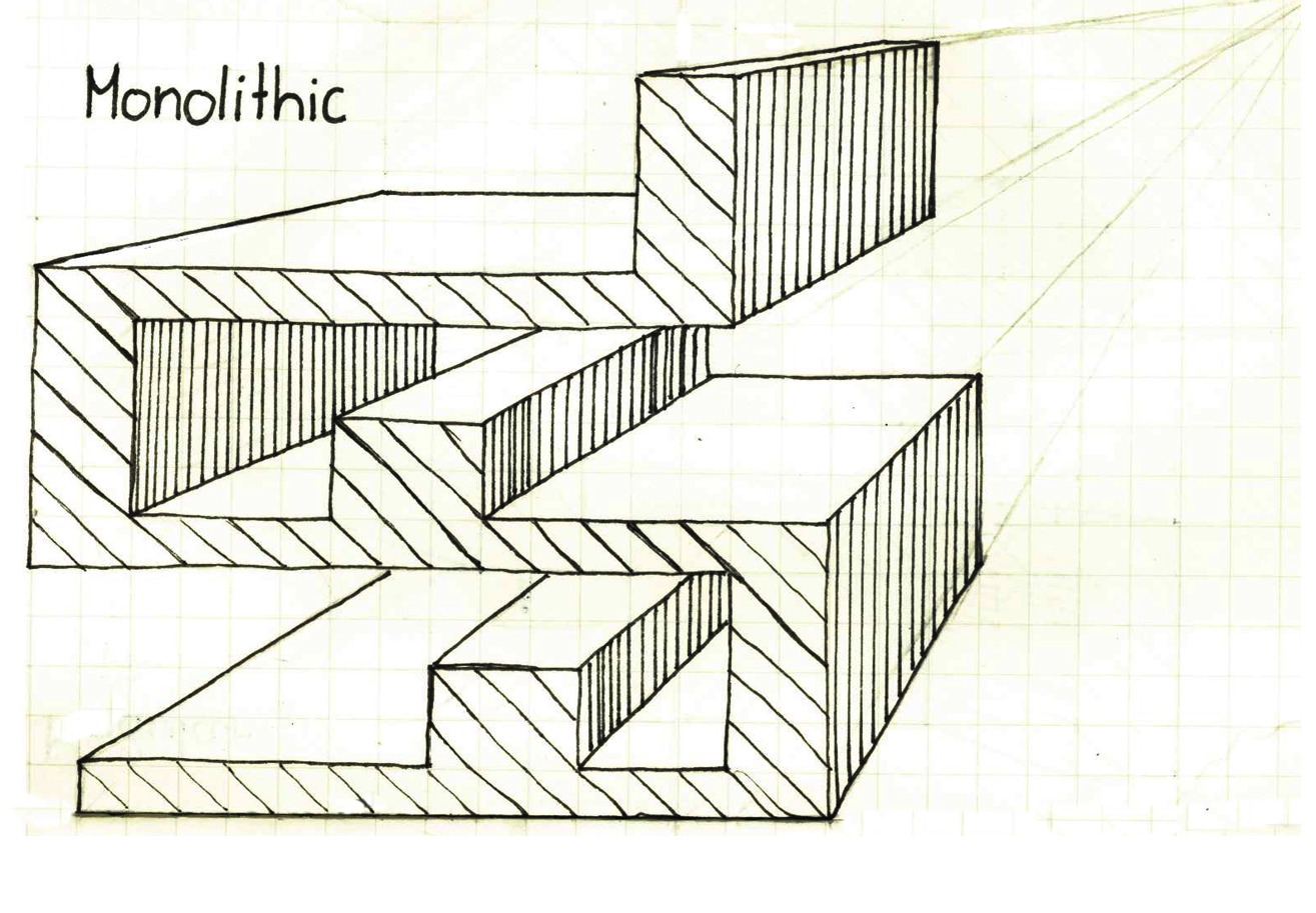
Out of the 18 concepts we drawn from architectural works in studio, the 3 that guided my project are expressed in this posts last 3 drawings: MULTI-VALUED DESIGN, ANCIENT AND PROSPECTIVE.


sexta-feira, 14 de junho de 2013
Initial plan
My rough zoning plan for experiment 3 (top) and the Slow House (bottom - plan and construction) of similar taper aspect that inspired my project.


terça-feira, 4 de junho de 2013
My valley
Inspiring my experiment 3 valley;

This is the " Cambara do Sul " Canyon at the southern high planes of Brazil.
domingo, 12 de maio de 2013
Articles Mashup
Arch-mashup:
“I prefer a spider web (…).1 Based
on a few geometric rules, the project exhibits more of his recent interest in
fluid and continuous spaces.2 You
have to understand the nature and the preciousness of all materials; I like a
combination of metal, concrete, timber, masonry and stone.
Louis Kahn used to tell his students: if you are ever stuck for inspiration, ask your materials for advice. "You say to a brick, 'What do you want, brick?' And brick says to you, 'I like an arch.' And you say to brick, 'Look, I want one, too, but arches are expensive and I can use a concrete lintel.3 White, black, shades of black and nature material colours. This building will encourage exchange and communication through a more explicitly fluid arrangement of a rich and diverse range of cultural activities. ”And then you say: 'What do you think of that, brick?' Brick says: 'I like an arch'".”
Louis Kahn used to tell his students: if you are ever stuck for inspiration, ask your materials for advice. "You say to a brick, 'What do you want, brick?' And brick says to you, 'I like an arch.' And you say to brick, 'Look, I want one, too, but arches are expensive and I can use a concrete lintel.3 White, black, shades of black and nature material colours. This building will encourage exchange and communication through a more explicitly fluid arrangement of a rich and diverse range of cultural activities. ”And then you say: 'What do you think of that, brick?' Brick says: 'I like an arch'".”
References:
1. ABC, “…in the
mind of the Architect”, Glenn Murcutt Architect, (assessed May 10),
http://www.abc.net.au/architecture/arch/ar_mur.htm
2. MA, ART APRAISAL, Toyo Ito, (assessed May 10),
http://www.abc.net.au/architecture/arch/ar_mur.htm
2. MA, ART APRAISAL, Toyo Ito, (assessed May 10),
3. The Guardian, Louis Kahn: the brick whisperer, (assessed May 10),
http://www.guardian.co.uk/artanddesign/2013/feb/26/louis-kahn-brick-whisperer-architect
terça-feira, 7 de maio de 2013
Model in Cryengine 3
Follows the link to my dropbox containing the level folder of my model:
https://www.dropbox.com/home
https://www.dropbox.com/home
5 Images
1. The neat look of the building conveys the Japanese heritage the architects have in common. While Sejima is focused on delivering a desired experience of lightness, Tange's space is grounded in scaled repetitions inspired by the idea of fractal.

2. The public two store patio connects the spaces in multiples levels, not only on a physical sense where the structure holds the two together but also in idealistic terms as both clients are humanitarians and caring for the public.

3. The openness of Sejimas space is a
response to the environment as she tends to do. In addition, the circular
shapes are to enforce her trait of flexibility and fluidity of the space use
and circulation.

4. In
detail: a gap between the roof and the wall where
little hidden columns connect the structure making it seem like the
roof is floating. Thus it reinforcing Sejimas resourcefulness to improve
the fluidity and lightness of the building


Assinar:
Postagens (Atom)